
Introduction
Mentoring SG is a national initiative to build a mentoring culture in Singapore and make guidance more accessible for youths.
In this project, I redesigned the mentoring experience to increase engagement and encourage youths to take the first step in connecting with mentors.
My Role
User Experience Designer
User Interface Designer
User Experience Researcher
A solo UX/UI case study focused on redesigning the Mentoring SG application.
THE PROBLEM
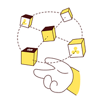
Users frequently browse the interface but do not take action. As a result, many do not fully benefit from the mentoring features designed to support their career growth.
CONTEXTUAL INQUIRY
Contextual inquiry was conducted with five youth users from the target audience, observing how they naturally navigated the application. By paying attention to their interaction flows, body language, and task efficiency, observation shows that...
Positive First Impression
Users rated the interface positively, noting that it felt modern and approachable

Low Return Intent
Users weren’t confident about returning, signalling unclear value delivery

Low Conversion Rate
Users show a low click-through rate, pointing to a gap between discovery and action
UNDERSTANDING MENTORINGSG
To validate my findings and gain deeper insight into mentoring goals, I connected with the Product Manager to cross-check insights with existing user patterns.


KEY FINDINGS

Low youth engagement
Discussions with the Product Manager and organisational stakeholders confirmed that Mentoring SG is experiencing low conversion and interaction rates among youths.
Positioning challenge
Mentoring SG aims to serve as a central hub for promoting mentoring organisations, but some organisations currently perceive it as a competitor rather than a collaborative partner.
AN OPPORTUNITY
HMW reduce friction and improve clarity for users while positioning Mentoring SG as a trusted hub, so that engagement increases across both youths and organisations?
THE USERS
I identified two primary user segments we can better support by clearly engaging the value of Mentoring SG
The Uncertain User
Curious about industry insights but unsure where to begin. They lack confidence and may need reassurance before reaching out to a mentor.


The Programme Manager
They seek reliable and aligned partners who can enhance their organisation’s mentoring initiatives.
This group needs transparency and clarity on collaboration opportunities.
NEXT THINKING
Where do users form their first impression of mentorship?
The most important touchpoint is the Mentor Page, the space that should motivate youths to begin their mentoring journey.
Positive First Impression
Users rated the interface positively, noting that it felt modern and approachable.
HEURISTICS EVALUATION
Understanding how existing applications present information in a clear and engaging way helped inform the design direction and principles for the individual mentor page.

🔍 ADPLIST Heuristic Evaluation
Match Between System and the Real World
The mentor profiles follow a logical, real-world order of information: who they are, what they do, and how to connect with them.
Recognition Rather Than Recall
The menu clearly lists all features, reducing the need for users to remember what the platform offers.
Aesthetic and Minimalist Design
ADPList avoids overwhelming users by placing secondary features inside a clean, expandable menu.
💡 Consideration
Structure mentor info on to mirror ADPList’s layout concise, scannable, and ordered by user priority. Also consider using a well-labeled menu to expose less-used features without cluttering the homepage.

🔍 AGODA Heuristic Evaluation
Match Between System and the Real World
Listings follow a clear information hierarchy: price, location, ratings, and availability, making comparisons intuitive.
Recognition Rather Than Recall
Key information is visible at a glance, using bold colours and labels, reducing the need to remember details across screens.
Visibility of System Status
Real-time cues like availability and discounts keep users informed throughout booking.
💡 Consideration
While Agoda performs strongly across most heuristics, reducing visual competition from promotional elements could further improve scannability and decision efficiency.
BEFORE REDESIGN
.png)

Multi-Step Navigation
Low Perceived Credibility
Lack of information
What’s preventing users from taking action in the current experience?
1
Lack of Information
Users don’t have enough details about each mentor to determine fit, which lowers confidence
2
Multi-Step Navigation
3 out of 5 testers felt confused or hesitant.
Moving from industry selection to booking a session required too many steps
3
Low Perceived Credibility
60% of users felt the interface lacked trust and reassurance.
The pop-up layout weakened the first impression and reduced excitement
So, how can we make this space more useful and valuable?
WIREFRAME
Started by defining the key information required on the page, then sketched multiple low-fidelity wireframe variations for the web version to explore layout, flow, and overall structure.

Navigation & Wayfinding Clarity
Feedback:
Users struggled to locate key actions (e.g. booking sessions, asking questions) due to unclear labels, missing navigation cues, and inconsistent placement of features.
Solution:
Clarified navigation by standardising labels, adding clearer section titles, and improving visual affordances (e.g. buttons vs links) to make primary actions immediately recognisable.
LOW FIDELITY
Started by defining the key information required on the page, then sketched multiple low-fidelity wireframe variations for the web version to explore layout, flow, and overall structure.
Session Booking
.png)
Enables direct booking from mentor profiles
Mentee Reviews
-1.png)
Displays mentor reviews directly on profiles
Mentor Communities
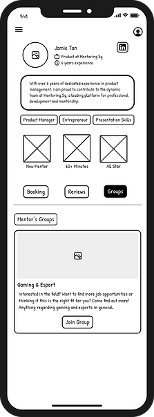-2.png)
Shows mentor group memberships and interests
Microcopy & Feedback Accuracy
Feedback:
Minor copy issues (e.g. misspellings, unclear confirmation messages) reduced clarity and confidence during task completion.
Solution:
Refined microcopy and system feedback to be clear, accurate, and consistent, reinforcing user confidence at key moments such as successful bookings.
USER FLOW
This user flow maps the journey from discovering a mentor to learning about their profile and successfully booking a mentoring session.

Introducing A Personalised and Streamlined Mentoring Space
This space sits directly on the Mentor page, building on existing Community features and introducing reviews to enhance trust and help users feel more confident starting their mentorship journey.
Mentor Page Structure
Relevence
Something personal about the mentor
Call to Action
A direct next step that guides users toward booking a session or exploring more details

Transparency
Provides clear information about the mentor’s background and expertise.
Assurance
Shows personalised and credibility-building elements, such as reviews or shared communities
Use Cases
Discovery
This flow was designed to promote discovery and build confidence, allowing youths to learn about the mentor before committing to a booking.


Added Industry segment
By clearly outlining offerings and partnerships, this helps organisations identify reliable, aligned collaborators and understand collaboration opportunities.


HERE ARE THE FINAL REDESIGN
After
More streamlined structure that reduces cognitive load and supports decision-making.
Introducing Added Feature:
Industry Segment
A dedicated section that highlights mentorship programmes, their offerings, and their partner organisations.
This helps
-
youths understand the range of mentorships available
-
organisations feel represented rather than overshadowed
-
Mentoring SG communicate its role as a central hub
Reflection
Through this case study and by attending events hosted by Mentoring SG, I was exposed to a wide range of perspectives. Conducting my own user testing and shadowing users helped me better understand the real pain points they experience. Given the opportunity, I would further enhance the UI and branding, and test the redesigned solution with Mentoring SG’s existing user database to evaluate its effectiveness at a larger scale.